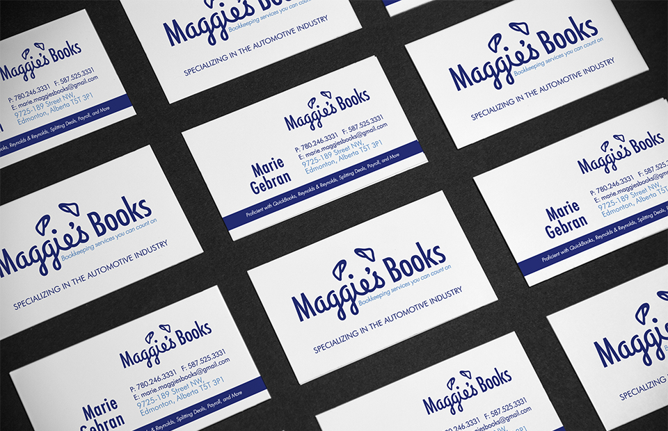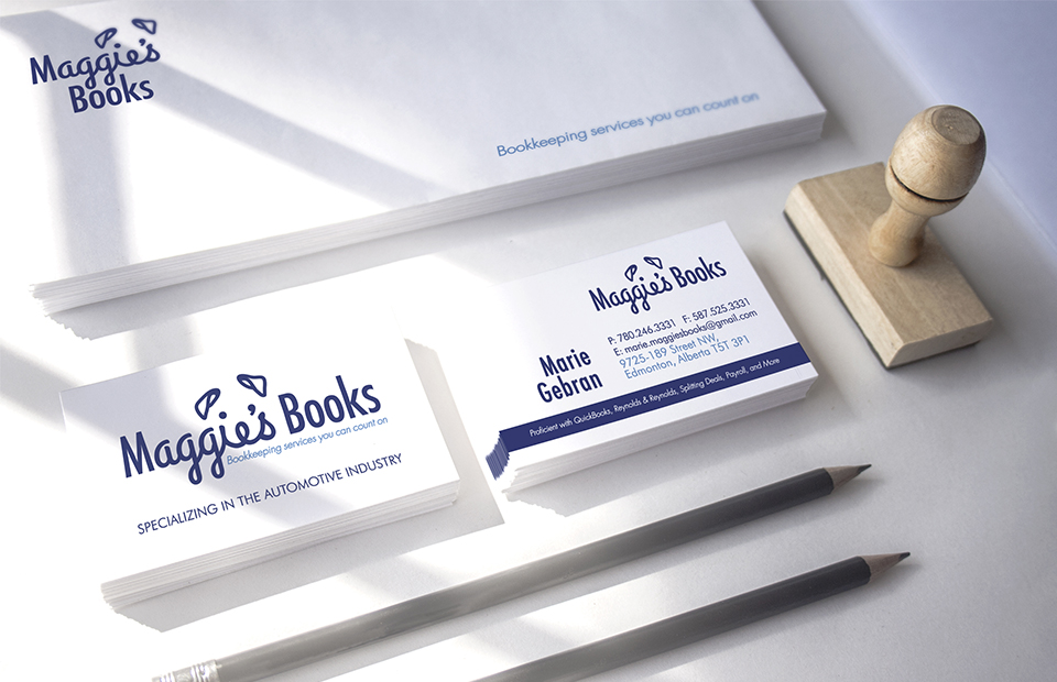
Maggie’s Books is an accounting company in Edmonton that was named after our clients lovable pooch. It was easy to turn to the obvious when we initially started brainstorming: books, charts, and yes even a calculator all made their way into our conceptualization process. However, with this logo we wanted to steer clear of the obvious, so we decided to create a word mark logo, which is a graphic representation of the companies name (think FedEx). We love the challenge of a word mark logo because you are limited to just letters as your design element. From sketching out the name “Maggie’s Books” over and over again, we started to notice a pattern with the last three cursive letters in the word “Maggie.” Suddenly the dot in the “i” and the apostrophe no longer looked like letters, but like eyes. After countless sketches, Maggie was cleverly created out of her own name. We believe a logo should represents who your company is, not always what it does, otherwise every accountant would have a chart graph in their logo, and we simply can’t have that. Instead we created a fun, memorable logo that fits our clients personality.