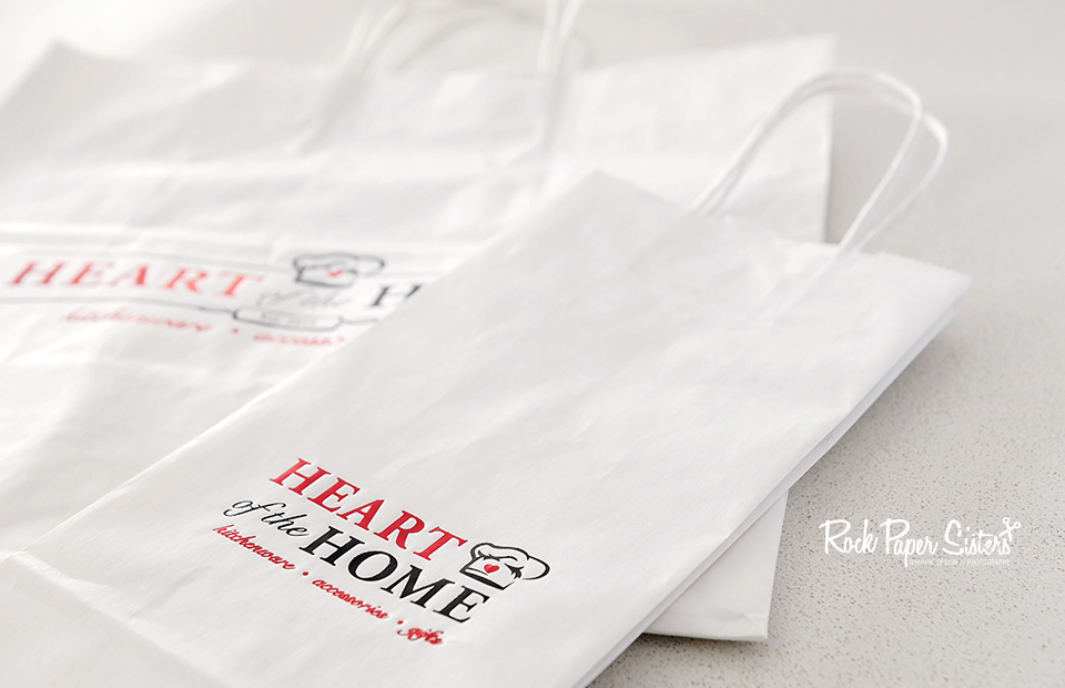
An incomplete logo will stare back at you for hours, you simply can’t wrap your head around it… “what’s stopping me from loving my design.” That’s where we come in.
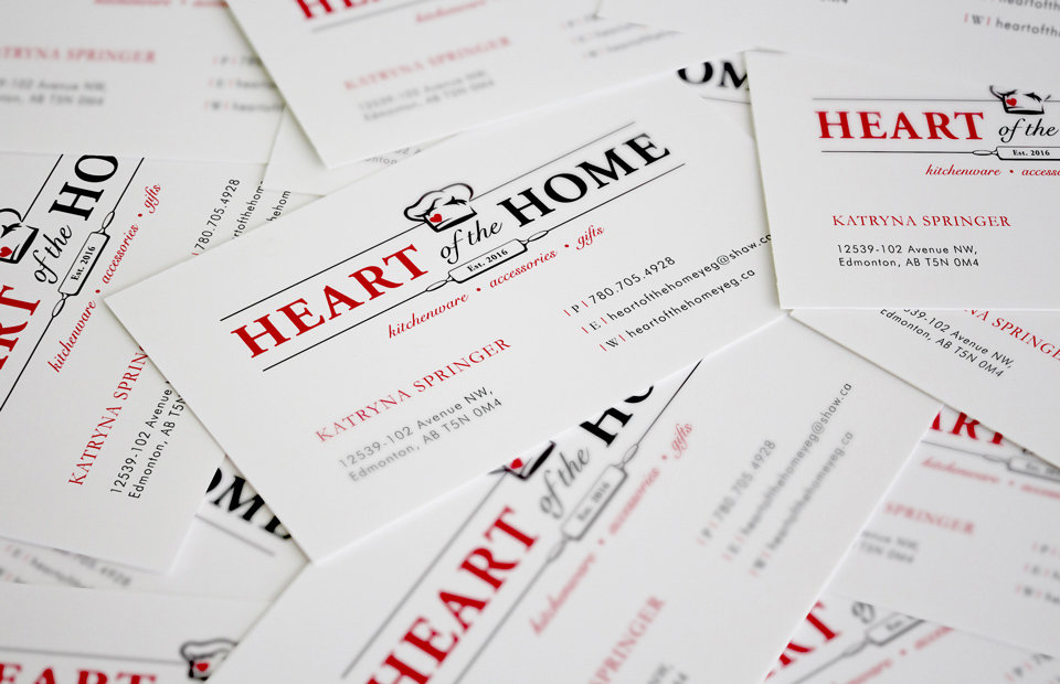
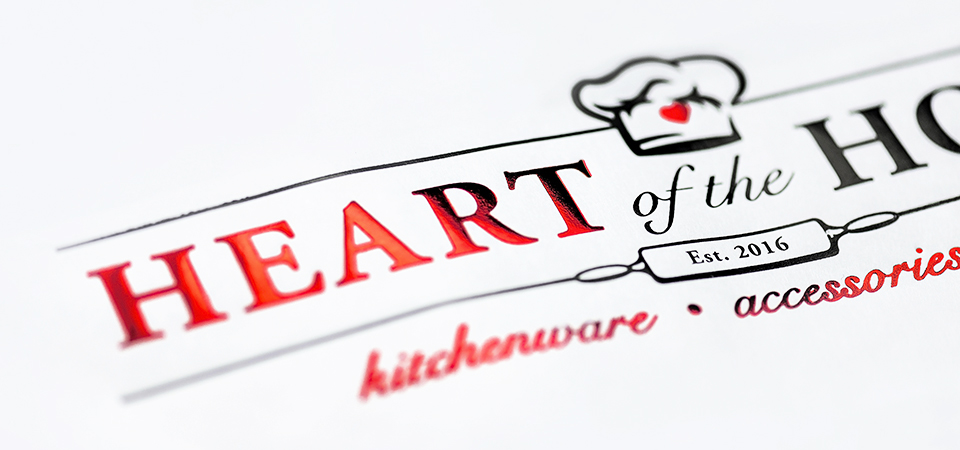
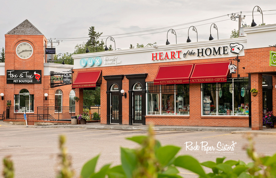
Our client came to us with a design element she loved, a chefs hat that was sketched by her husband. We were told we had complete freedom over the logo as long as that hat remained untouched. We sat down and discussed over London Fogs about what her company was about, a kitchen retail store beautifully located in High Street between Lux Beauty and Carbon Environmental. We ended up designing a few variations of the logo to accommodate our clients individual needs. We started with the store sign, a challenge brought on by an extremely rectangular work area. We sketched and brainstormed, and after going through our archives of fonts we finally found a combination that we loved, a perfect harmony between a serif and a cursive font.
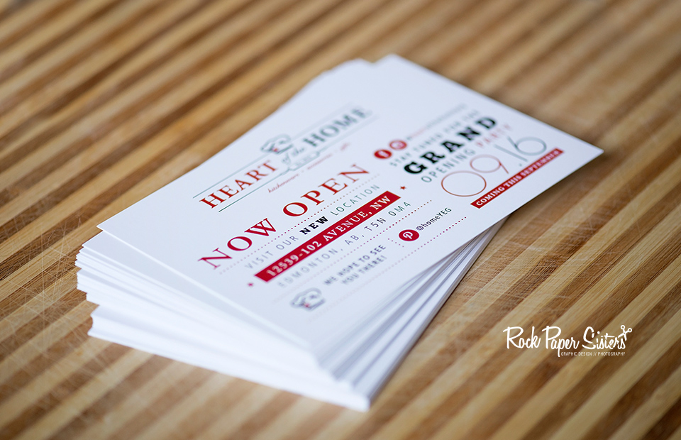
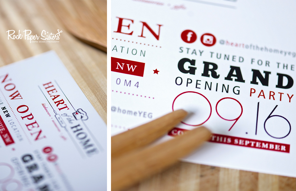
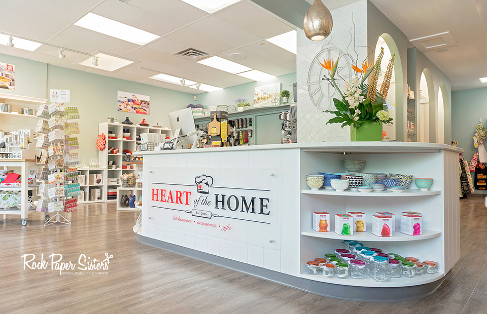
When opening a new business, along comes the need to get your name out there and advertise, after all you need people to know who, what, and where you are… so we designed some flyers and business cards to do just that. Now while Heart of the Home is open right now, keep an eye on there social media to find out the exact date of the grand opening! Trust us when we say this store is beautiful, along with all the products inside. The bakers inside of us are already eyeing a few products.